




Brand positioning
Brand strategy
Four Two partnered with RAVE to break category monotony, to make hydration feel
cool, relevant, and fresh without compromising its core purpose.
The founder’s vision became our starting point. We studied the hydration category and explored consumer behaviours and expectations to identify gaps in the market. The objective was to uncover an opportunity for RAVE to break away from category conventions and build a distinct, relevant space of its own. Rather than being defined by function alone, RAVE would be defined by its energy: a feeling, a vibe and a culture. This gives the brand room to grow into new flavours and formats while staying unmistakably bold.
So we researched into a tired
category for opportunities.
The founder’s vision became our starting point. We studied the hydration category and explored consumer behaviours and expectations to identify gaps in the market. The objective was to uncover an opportunity for RAVE to break away from category conventions and build a distinct, relevant space of its own. Rather than being defined by function alone, RAVE would be defined by its energy: a feeling, a vibe and a culture. This gives the brand room to grow into new flavours and formats while staying unmistakably bold.
We turned a category insight
into a brand story.
Our research pointed to an opportunity to build RAVE beyond its functional benefits. We needed a narrative that could make hydration more engaging, give the brand a distinctive personality and create a foundation for its wider identity. We looked for a way to connect the category to a story people already knew.

The thirst-quenching revolution begins with a crow. Inspired by the fabled thirsty crow- a hustler, a doer, a problem-solver. RAVE is all about getting what you want, staying sharp, and looking cool while you do it. It’s hydration without compromise. Energy without crash. Taste without trash. This is hydration, smarter and upgraded. RAVE is built on hustle energy, real ingredients, and a story older than time. It’s your brain’s new favorite beverage.
We turned a category insight into
a brand story.
Our research pointed to an opportunity to build RAVE beyond its functional benefits. We needed a narrative that could make hydration more engaging, give the brand a distinctive personality and create a foundation for its wider identity. We looked for a way to connect the category to a story people already knew.
The thirst-quenching revolution begins with a crow. Inspired by the fabled thirsty crow- a hustler, a doer, a problem-solver. RAVE is all about getting what you want, staying sharp, and looking cool while you do it. It’s hydration without compromise. Energy without crash. Taste without trash. This is hydration, smarter and upgraded. RAVE is built on hustle energy, real ingredients, and a story older than time. It’s your brain’s new favorite beverage.
We are breaking the monotonous look and feel of hydration drinks in India.
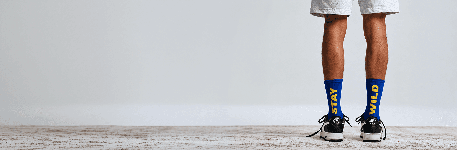
The design breaks away from the monotony of conventional hydration drinks, making hydration feel cool, relatable, and inclusive. Designed to fit seamlessly into concerts, gym sessions, and parties as a refreshing mixer, RAVE combines bold colours, expressive typography, and playful iconography to create a youthful identity that stands out on shelves and makes people proud to carry it.
He is Peblo - He is the spirit animal of RAVE. Mascot inspired by the classic tale, reimagined for today. Smart, curious, and just a little too cool for your regular jungle tales. Bucket hat on, sunglasses low, sneakers laced, and shorts baggy - he walks (flies?) with the confidence of someone who’s figured it out.
We developed a bold, mixed-typography wordmark to give RAVE a youthful, energetic edge. Contrasting letterforms bring movement and individuality, while the crow’s beak subtly integrated into the ‘E’ connects the logo to Mr. Peblo and the brand’s story. The result is a distinctive identity built to stand out and stay recognisable.
Hydration shelves are full of clinical whites and washed-out pastels. RAVE needed colours that feel like a night out, not a pharmacy aisle.
Rave Blue and Electric Yellow became the core pair: high-contrast, impossible to miss in a fridge and instantly recognisable across cans, merch and social. Neutral White and Pebble Grey keep everything grounded.
Our research pointed to an opportunity to build RAVE beyond its functional benefits. We needed a narrative that could make hydration more engaging, give the brand a distinctive personality and create a foundation for its wider identity. We looked for a way to connect the category to a story people already knew.
Behind the brand is a whole lot of thinking.
See how it came together.