


Kimochii
A Quiet Ritual of Feeling
Four Two partnered with Kimochii to
Inspire conscious living through self-care and wellness products.

Brand Positioning
Click to know more

Hydration Reimagined
Click to know more

Beyond Functionality
Click to know more

Don't Stop Exploring
Click to know more
Pre-launch custody

About The Project +
Our research established two key decisions: a name that could grow beyond scented candles into a broader lifestyle brand, and the Caregiver archetype to reflect a world of comfort, well-being, and everyday luxury. These principles guided the development of the visual identity, from typography and colour palettes to imagery and brand assets.
Through exploration, prototyping, and refinement, we evaluated directions ranging from expressive and playful to minimal and understated. Each element was chosen to reflect the brand’s promise of making people feel good, coming together in a cohesive visual system that feels calm, intentional, and deeply personal.
We wanted a name that has to be explained, sparks curiosity, and builds meaning overtime. At the same time it should rooted in nature and sensuality. 'Good Feeling' is a thought that kept coming back and it just felt right.
Since its too direct to use 'Good Feeling' as a brand name, we looked it up in various languages until one phrase stood out for both its sound and soul: Kimochi ii, meaning “feels good.”
Our decisions are what
define us in the long run.
A brand that belongs to a luxury lifestyle
category that is easy to go with.
Kimochii's assets
define their brand.
Packaging is the major
touchpoint of the brand.
The bird form - softly curved like a child’s drawing - symbolizes the freedom to feel good in your own way.
It carries the spirit of nostalgia, emotional ease, and fluidity that defines kimochii.
Brand Element
Nomenclature

“Feeling good” isn’t always loud or obvious. Sometimes it’s still, warm & deeply personal. That became our direction: to craft a tagline that captures that feeling.
A moment for you, it’s simple, warm, and endlessly personal. It’s about carving out a pause, a breath, a sensory moment just for yourself. That’s what every Kimochii product promises.
Logo
“Feeling good” isn’t always loud or obvious. Sometimes it’s still, warm & deeply personal. That became our direction: to craft a tagline that captures that feeling.
A moment for you, it’s simple, warm, and endlessly personal. It’s about carving out a pause, a breath, a sensory moment just for yourself. That’s what every Kimochii product promises.

Tagline
We wanted a name that has to be explained, sparks curiosity, and builds meaning overtime. At the same time it should rooted in nature and sensuality. 'Good Feeling' is a thought that kept coming back and it just felt right.
Since its too direct to use 'Good Feeling' as a brand name, we looked it up in various languages until one phrase stood out for both its sound and soul: Kimochi ii, meaning “feels good.”
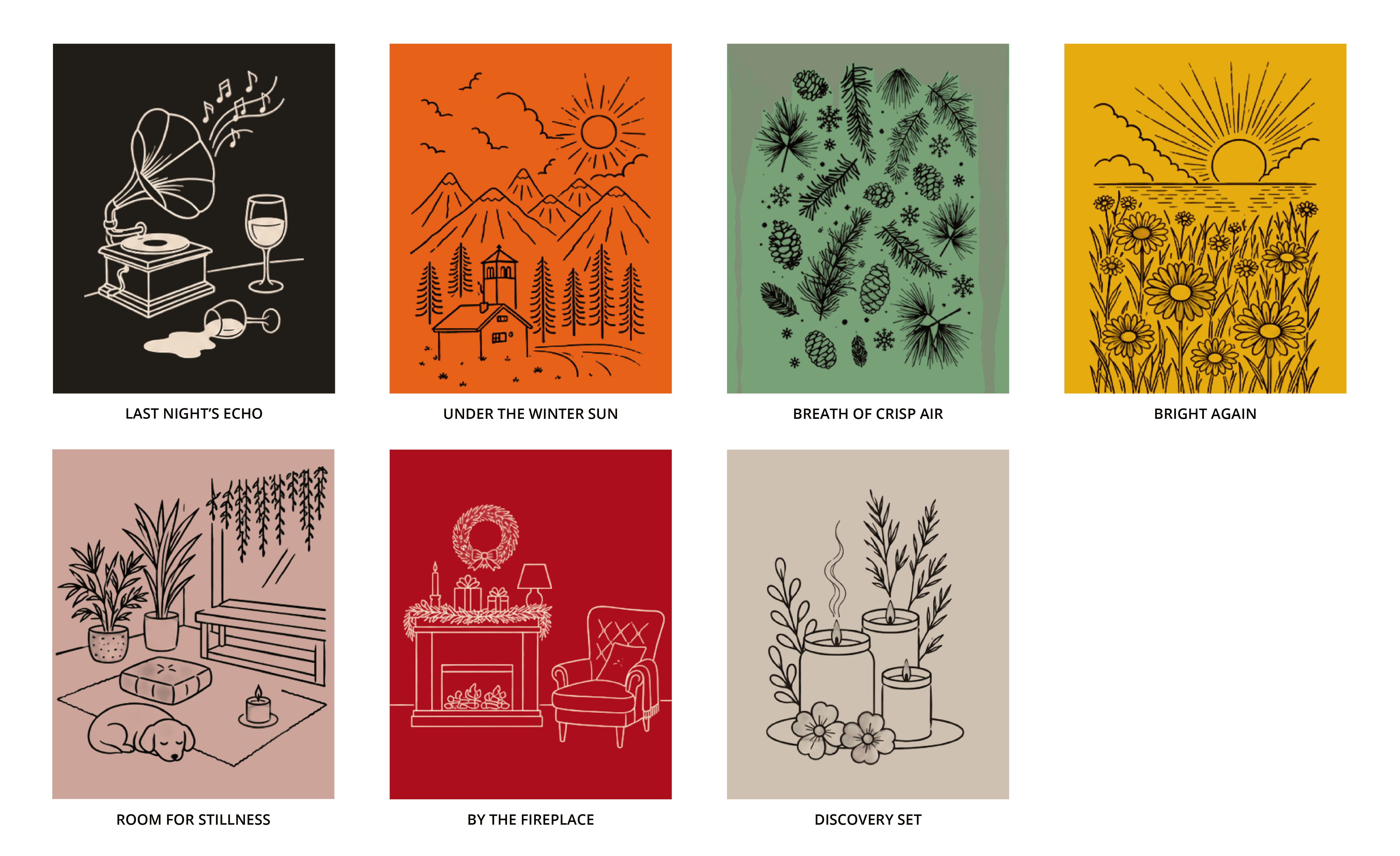
Every candle has a feeling. We gave that feeling a world. The Kimochii packaging turns fragrance into a visual escape - where each candle’s name, mood and notes come alive through its own illustrated universe.
No two candles tell the same story, but together, they belong to the same world.


Kimochii doesn't ask you to explain how you feel. Like morse, it's a quiet signal - a whisper rather than a broadcast. You light it to feel something.
Kimochii doesn't ask you to explain how you feel. Like morse, it's a quiet signal - a whisper rather than a broadcast. You light it to feel something.
Behind the brand is a whole lot of thinking.
See how it came together.
See how we build brands
We start with a research
to back our claims.
Kimochii was envisioned as a brand that could grow beyond a single product category and occupy a distinct space in the customer’s mind. The idea was to remain abstract enough to evolve, yet definite enough to be recognised. Rather than being defined by what it sells, Kimochii would be defined by what it stands for: a feeling, an experience, and a way of living. This gives the brand the freedom to expand into new categories while maintaining a consistent identity rooted in well-being, thoughtful aesthetics, and everyday luxury.
Our research established two key decisions: a name that could grow beyond scented candles into a broader lifestyle brand, and the Caregiver archetype to reflect a world of comfort, well-being, and everyday luxury. These principles guided the development of the visual identity, from typography and colour palettes to imagery and brand assets.
Through exploration, prototyping, and refinement, we evaluated directions ranging from expressive and playful to minimal and understated. Each element was chosen to reflect the brand’s promise of making people feel good, coming together in a cohesive visual system that feels calm, intentional, and deeply personal.