Grannyways
Brand Identity l Logo Design
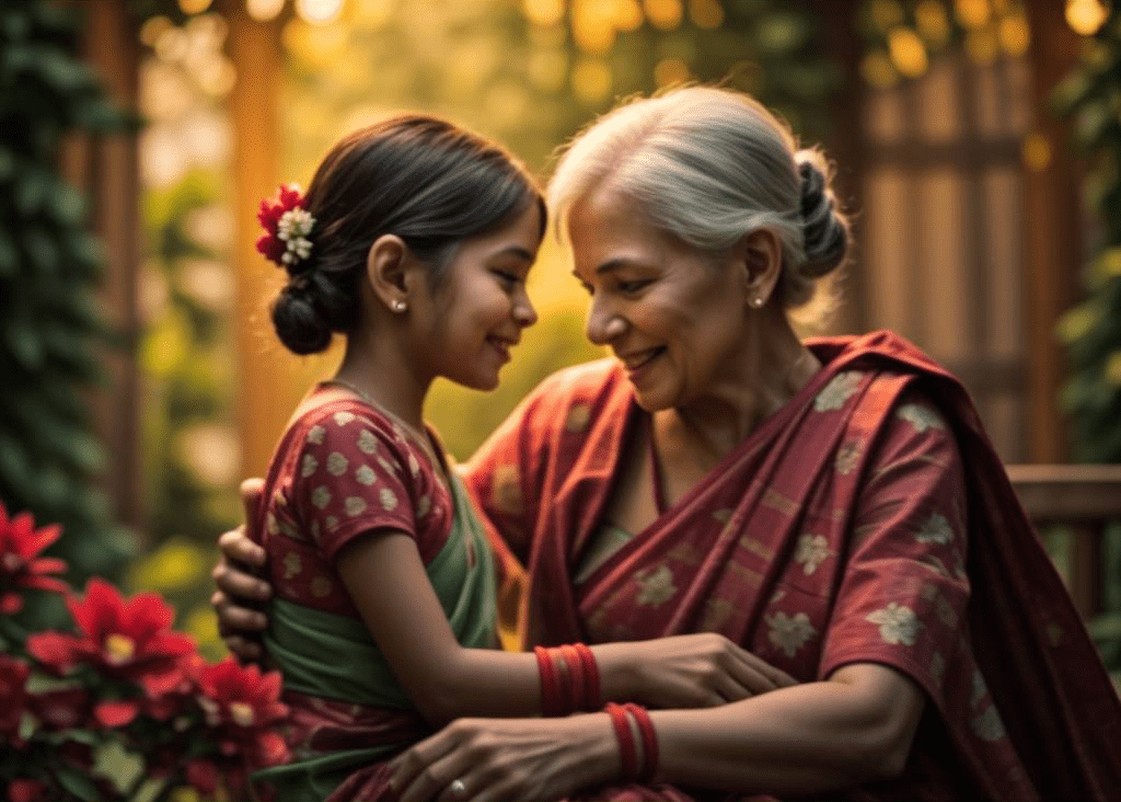
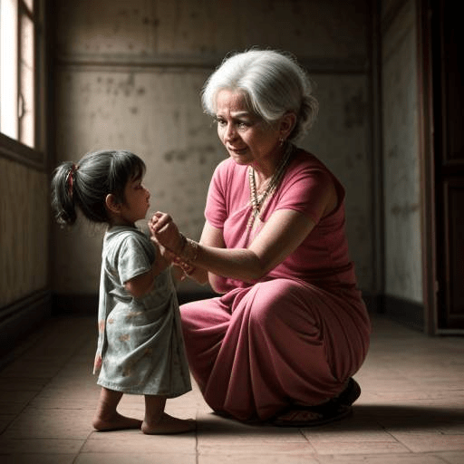
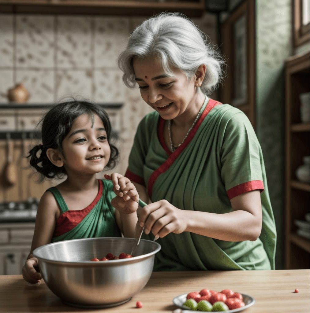
Grannyways is all about bringing back the goodness of traditional methods in our modern world.
Dedicated to making premium, healthy products using age-old techniques, honoring the wisdom of our grandmothers – our brand celebrates its heritage, prioritizes health, and cherishes the purity of its offerings, just as our grandmothers did.
Core Values
Rooting Back to The Original Roots of our Granny
To embrace the timeless path directed by our Grandmothers.
What we were looking for
An element that is both distinctive & scalable.
Should be easily embeddable on various mediums.
Should look approachable and minimal.

A Wheat Grain
The Perfect Element
We were in search of something that can resonate with grandmothers in the most minimal way.
And we found our perfect element in the main product of our brand.
A Wheat Grain
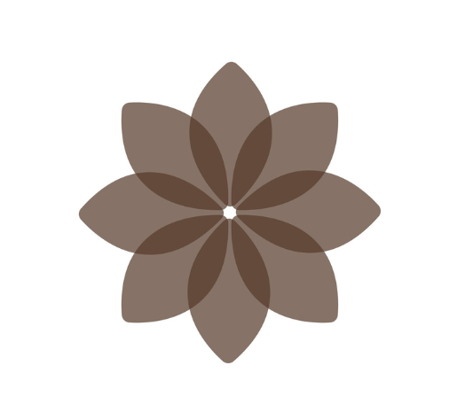
While looking at our foundational element, we wanted to play with it more to create a symbol that represents the wheat grain and at the same time conveys the Granny's Touch.


We Replicated Our Element

Integrating Our Grandmother's Spirit
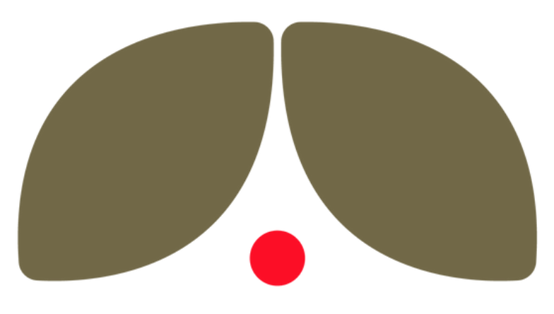
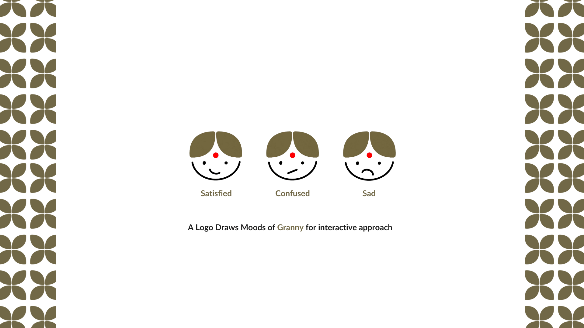
Even though we have found our perfect element, The logo remains incomplete without the presence of our grandmothers' warmth and gentle spirit.
Our search for a symbol that captures their essence landed us on the significance of their Bindi.
Adding The Granny's Touch


Grannyways
Warm and Pure
Soft logo corners
Rooted to the Ground
Earthy primary and secondary colour
Punch of Enthusiasm
Red colour introduced as tradition
Brand Voice

Primary Colour
#553A29
Secondary Colour
#716847
Highlight Colour
#FC0E26
Base Colour
#FFFFFF
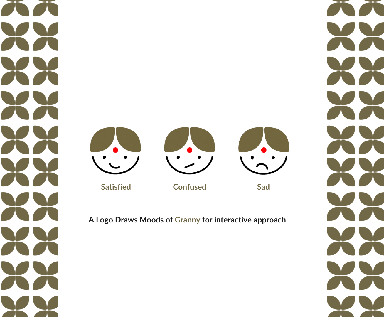
Now, It's Time To Explore The Practical Usability And Scalibility

A logo that speaks the Brand language.

Nostalgic, Warm and Cozy
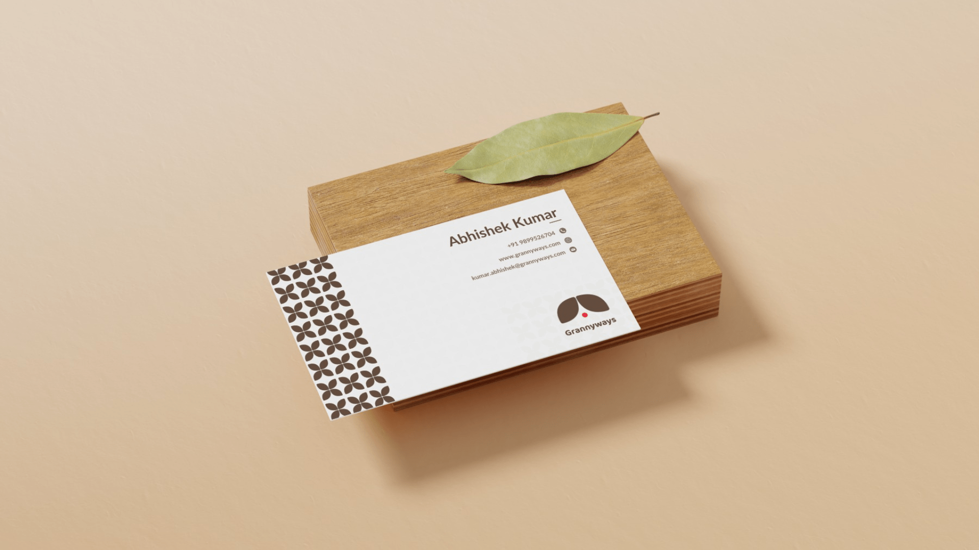
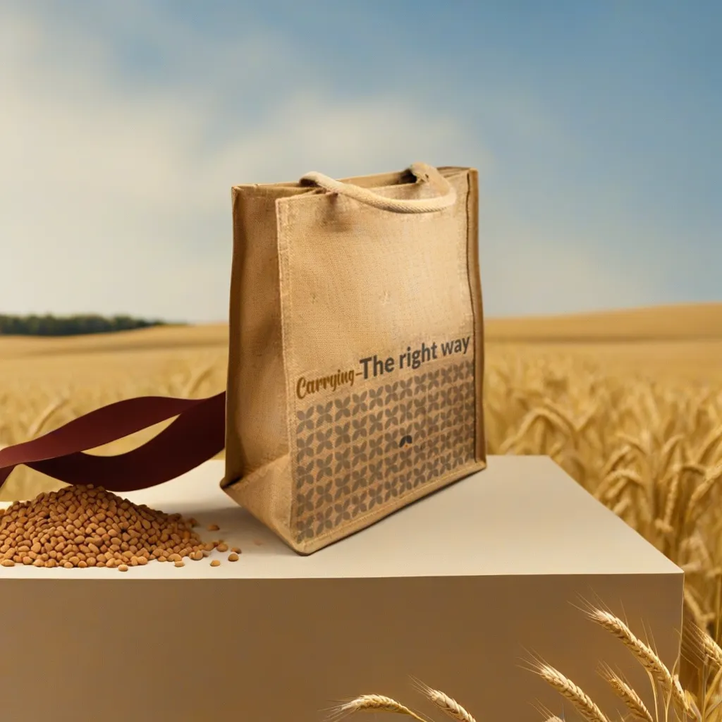
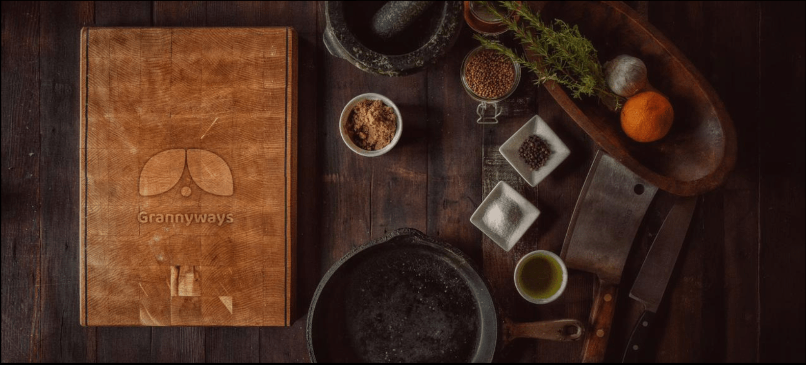
The brand color effect refers to the way a particular color influences the perception of a brand & shapes people’s emotional and psychological responses to it. Grannyways embraces a nostalgic & earthy essence that will take you down the memory lane and feels warm and cozy.
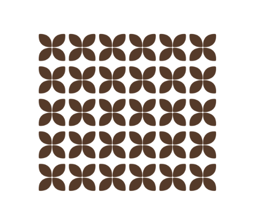
Endless patterns to explore
Brand's Festival Design

Wheat Packaging Design
